Urban Design Gone Right ... and Wrong
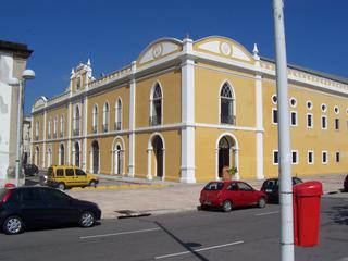
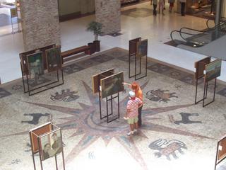
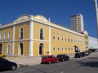
One of the newest and best attractions of Recife Antigo is Paço Alfândega, a upper-end shopping centre, built in an old Convent-come-Customs-House dating back from 1732. Of all the Historic-meets-Modern renovations/upgrades that I have seen, this one is one the best examples of restoring a building for modern usage while keeping the historic structure intact. Paço Alfândega has a small mix of boutiques, cafés, restaurants, and art exhibits. On the fourth floor, there is an outdoor terrace with a terrific view across the river as well as Assucar, a fabulous restaurant specializing in regional cuisine [and the great view!]. Since the Paço is a little bit out of the way for most people and a tad on the pricey side, it also tends to be a rather quiet mall, perfect for enjoying a cup of coffee and little wander.
Paço Alfândega:
Side Entrance:

Central Mosaic and Art Exhibit:

More Art Exhibits and a Café:

So where has the urban design gone wrong? Well, just next door to the Paço is Recife's newest bookstore, Livraria Cultura. From the inside, Livraria Cultura is amazing. It has a huge selection of books and cds in all kinds of languages. There is a funky café on the second floor and tons of comfortable couches for people to peruse the books before buying. In all, I suspect that it is a welcome addition to Recife's literary scene. The downside is that from the outside, the building is perfectly atrocious. Made of graying cement, it looks more like a penal insitution than something that belongs next to the traditionalness of Paço Alfândega. I have no intelligence on whether Livraria Cultura built the building or whether they moved into an already existing space. It almost seems like they tried to copy some of the Paço's design.... The contents and interior are great, unfortunately the exterior leaves a bit to be desired. You can catch a glimpse of the Livraria to the right of the Paço.


0 Comments:
Post a Comment
<< Home